The Blockbuster Experiment—The Next Blockbuster
I call this “The Blockbuster Experiment.” The Blockbuster Experiment is an attempt to progress Blockbuster’s brand with a rebirthing by refurbishing the usable and shedding the outdated.
Inspired by Andrew Kim’s The Next Microsoft, I gave myself this exercise and dedicated the evening hours of the weekend.
DISCLAIMER: “The Blockbuster Experiment” is a personal project, and the contents of this project do not reflect the views of Blockbuster LLC, formerly Blockbuster Inc.
Problem
The problem is the current Blockbuster fails to embrace the future and take steps to innovate–innovation and progression is stagnant. For many, including myself, the mention of the word “Blockbuster” merely creates a mosaic of nostalgic memories of renting video games on Sega Genesis or SNES, or the Die Hard Trilogy on VHS.
Even worse, what people perceive about Blockbuster matches up to who they are in reality; their latest attempt at the future is their “Blockbuster Total Access” plan which offers unlimited rentals by mail and in-store exchanges, but fails to deliver to consumers at an on-demand level (e.g., streaming on mobile devices).
Proposed Solution
Here’s a fresh look at a proposed solution.
Brand refresh
Blockbuster needs to represent the future in movie and video game rental and delivery. A new logo and look to complement its renewed vision and shedding of the archaic, outdated feel.
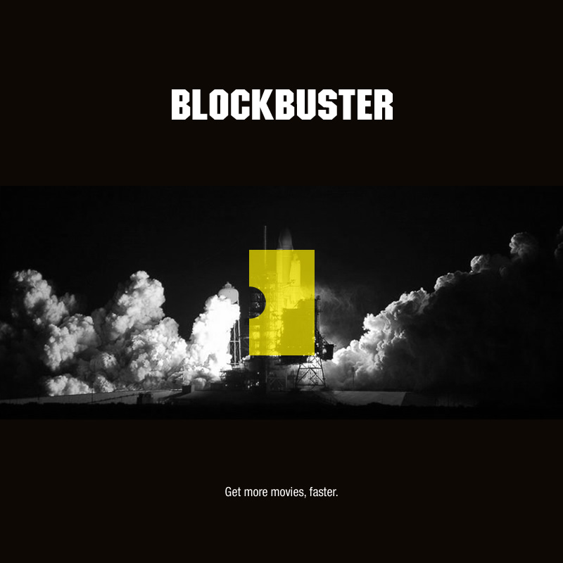
Photo above by photographer Jim Baker


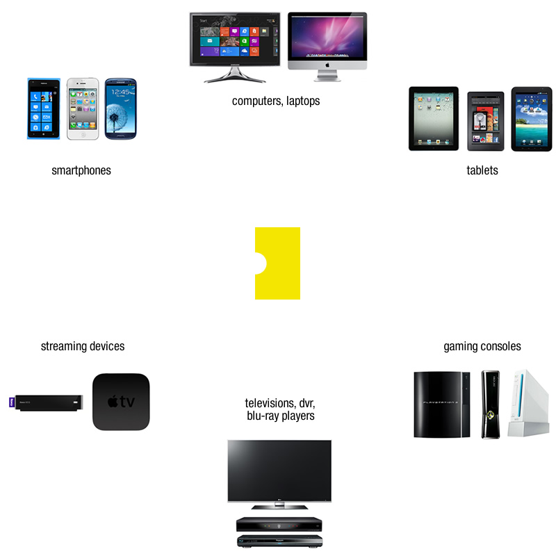
Delivery
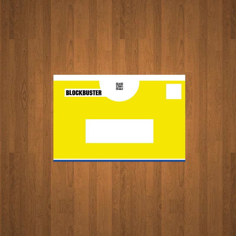
Solutions to deliver content that must be a given in this era in order to compete with the rest.
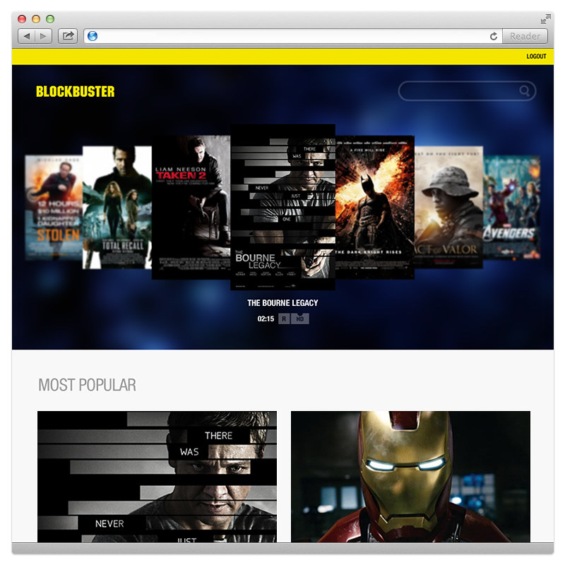


Application
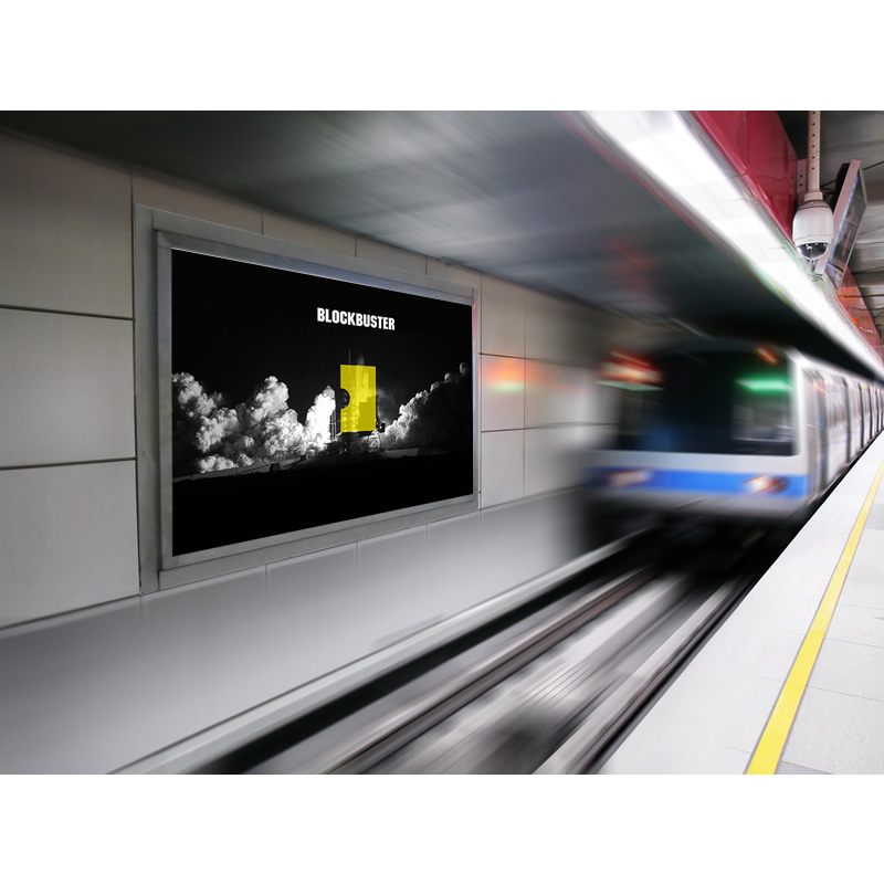
A visual application of Blockbuster’s new logo and look.
