Animated Toggle in React Native
Animating elements in React Native isn’t as straight forward as you may expect. If you’re used to animating elements with CSS, you may be used to using transition and transform, like such:
.element {
  transition: transform 1s ease;
}
.element:hover {
  transform: translateX(20px);
}
Unfortunately, React Native can’t animate vanilla CSS. Thankfully React Native comes baked with the Animated library to help you build animations.
Simple Toggle
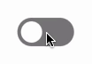
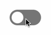
Let‘s start by creating a simple toggle that has on-off states and changes state when you tap on it.
import React from "react"
import { TouchableOpacity, View } from "react-native"

export default class App extends React.Component {
  state = {
    isOn: false,
  }

  toggleHandle() {
    this.setState({ isOn: !this.state.isOn })
  }

  render() {
    return (
      <View>
        <TouchableOpacity
          activeOpacity={0.5}
          style={{
            width: 64,
            height: 32,
            borderRadius: 32,
            padding: 4,
            backgroundColor: this.state.isOn
              ? "limegreen"
              : "gray",
          }}
          onPress={() => this.toggleHandle()}
        >
          <View style={{
            width: 24,
            height: 24,
            borderRadius: 32,
            transform: [{
              translateX: this.state.isOn ? 32 : 0,
            }]
          }} />
        </TouchableOpacity>
      </View>
    )
  }
}
<TouchableOpacity> is the toggle container while the inner <View> is the knob.
State isOn determines whether the toggle is on and off; and if it’s on, the knob is being translated 32px along the X axis.
To animate, typically we’d transition the transform and call it a day:
transition: transform 0.2s ease;
But this is React Native…
Animated
The Animated library is the recommend way to animate in React Native. It comes with predefined methods you can use to animate, but for this tutorial, we’ll only cover Animated.timing. Be sure to read the Animated API documentation to learn more.
timing() animates a values along a timed easing curve. It accepts 2 parameters: timing(value, config). The first is the animated value and the second is a config object.
To use Animated, it needs to be imported:
import React from "react"
import {
  Animated,
  TouchableOpacity,
  View,
} from "react-native"
We’ll use state animatedValue to set the initial state and manage the animated value of the toggle knob as the state changes.
state = {
  isOn: false,
  animatedValue: new Animated.Value(0),
}
We can then set the knob’s translateX as the value of state animatedValue:
<Animated.View style={{
  width: 24,
  height: 24,
  borderRadius: 32,
  transform: [{
    translateX: this.state.animatedValue,
  }]
}} />
We need to modify toggleHandle() to also animate the toggle based on the updated state. We’ll fire Animated.timing() in setState’s optional callback:
toggleHandle() {
  this.setState(
    { isOn: !this.state.isOn },
    () => {
      Animated.timing(
        this.state.animatedValue,
        { toValue: this.state.isOn ? 32 : 0 }
      ).start()
    }
  )
}
We can also customize the duration, delay, and easing of the animation:
import {
  Animated,
  Easing,
  TouchableOpacity,
  View,
} from "react-native"

...

Animated.timing(
  this.state.animatedValue,
  {
    toValue: this.state.isOn ? 32 : 0,
    duration: 250,         // in milliseconds, default is 500
    easing: Easing.bounce, // Easing function, default is Easing.inOut(Easing.ease)
    delay: 0,              // in milliseconds, default is 0
  }
).start()
The Easing module comes with a lot of predefined animations along with advanced functions for more complex ones:
easing: Easing.linear,
easing: Easing.bounce,
easing: Easing.elastic(0.7),
easing: Easing.bezier(0.75, -0.25, 0.25, 1.25),
Be sure to read more about it from the Easing documentation.
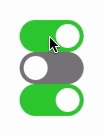
Here’s what the animated toggle looks like after putting it all together:
Stateful Toggle Component (Extra Credit)
The above solution works and is fine as an introduction to Animated, but it isn’t practical if there are more than one toggles to manage.
Instead, a reusable and composable solution like this would be ideal:
render() {
  return (
    <View>
      <Toggle
        isOn={this.state.alertsIsOn}
        onToggle={state => this.alertsToggleHandle(state)}
      />
      <Toggle
        isOn={this.state.newsletterIsOn}
        onToggle={state => this.newsletterToggleHandle(state)}
      />
      <Toggle
        isOn={this.state.trackingIsOn}
        onToggle={state => this.trackingToggleHandle(state)}
      />
    </View>
  )
}
Let’s begin by extracting a Toggle component.
// Toggle.js
import React from "react"
import PropTypes from "prop-types"
import {
  Animated,
  Easing,
  TouchableOpacity,
} from "react-native"

const knobOffset = 32

export class Toggle extends React.Component {
  static propTypes = {
    isOn: PropTypes.bool,
    onToggle: PropTypes.func.isRequired,
  }

  static defaultProps = {
    isOn: false,
  }

  state = {
    isOn: this.props.isOn,
    animatedValue: new Animated.Value(this.props.isOn ? knobOffset : 0),
  }

  componentDidUpdate(prevProps, prevState) {
    if (prevProps.isOn !== this.props.isOn) {
      this.setState(
        { isOn: this.props.isOn },
        () => {
          Animated.timing(
            this.state.animatedValue,
            {
              toValue: this.state.isOn ? knobOffset : 0,
              easing: Easing.elastic(0.7),
              duration: 100,
            }
          ).start()
        }
      )
    }
  }

  handlePress() {
    this.setState(
      { isOn: !this.state.isOn },
      () => this.props.onToggle(this.state.isOn)
    )
  }

  render() {
    return (
      <TouchableOpacity
        activeOpacity={0.5}
        style={{
          backgroundColor: this.state.isOn ? "limegreen" : "gray",
          width: 64,
          height: 32,
          borderRadius: 32,
          padding: 4,
        }}
        onPress={() => this.handlePress()}
      >
        <Animated.View style={{
          width: 24,
          height: 24,
          borderRadius: 32,
          transform: [{
            translateX: this.state.animatedValue,
          }]
        }} />
      </TouchableOpacity>
    )
  }
}
Of the changes, the main thing to note is that we’ve moved Animated.timing() to the componentDidUpdate() lifecycle method.
This allows us to compose Toggle and more easily manage the state of each independently:
// App.js
import React from "react"
import { View } from "react-native"
import { Toggle } from "./Toggle"

export default class App extends React.Component {
  state = {
    alertsIsOn: true,
    newsletterIsOn: false,
    trackingIsOn: true,
  }

  alertsToggleHandle(state) {
    this.setState({ alertsIsOn: state })
  }
  newsletterToggleHandle(state) {
    this.setState({ newsletterIsOn: state })
  }
  trackingToggleHandle(state) {
    this.setState({ trackingIsOn: state })
  }

  render() {
    return (
      <View>
        <Toggle
          isOn={this.state.alertsIsOn}
          onToggle={state => this.alertsToggleHandle(state)}
        />
        <Toggle
          isOn={this.state.newsletterIsOn}
          onToggle={state => this.newsletterToggleHandle(state)}
        />
        <Toggle
          isOn={this.state.trackingIsOn}
          onToggle={state => this.trackingToggleHandle(state)}
        />
      </View>
    )
  }
}
I encourage you to dive into the Animated API! It’s pretty powerful and can help you build some pretty complex animations in your app.