Animate SVG with CSS
Animating SVG with CSS is like animating any other element with CSS—it can be done with transitions, transforms, and keyframe animations. Once you’re familiar with the markup of an SVG, the rest is fairly straight forward.
I recently played around with animating SVG with CSS, and wanted to share what I did along with my findings and techniques.
We’ll start by taking a drawing, exporting it as an SVG, and adding some animations to it. Here’s the animation we’ll achieve:
Drawing
First step’s first—drawing. The drawings above were done in Illustrator so for this guide, I’ll be referencing it. Illustrator is also great for saving as SVG.
Size the artboard. Because we’ll be making the SVG responsive, actual size doesn’t really matter, but proportion does. Position the images on the artboard as it would look in the first frame of the animation.
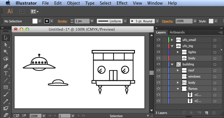
Separate the parts of your drawing into layers and groups (like you would in Photoshop), especially if any of them are going to be animated. (I’ll further explain why later, but basically this will help you identify the components of your drawing in the markup of the SVG)
If you’ve added text with the Text Tool, convert them into outlines (if the user does not have the font installed, it’ll render in an unpredictable manner. By converting them into outlines, they’re converted into shapes and the font dependency is eliminated). Select the text, then from the menu, Type > Create Outlines.
SVG
When you’re done, save it as an SVG. From Illustrator: File > Save As... and select SVG (svg) from the Format dropdown.
You’ll then be asked to set your SVG options. Set them as follows, then save:
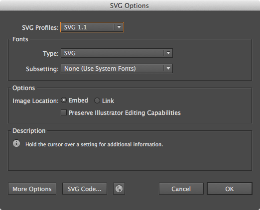
- SVG Profiles: SVG 1.1
- Fonts Type: SVG
- Subsetting: None
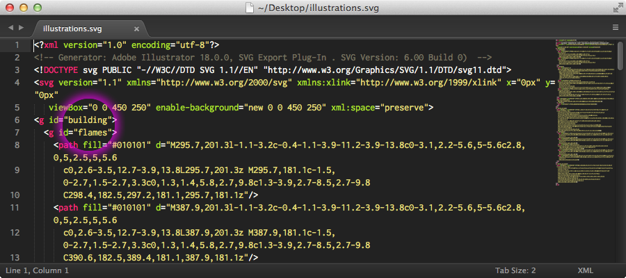
Open the SVG file in your text editor—you’ll notice the markup has the names of the layers and groups you created in Illustrator as ids. This is extremely helpful when identifying the elements of your illustration.
HTML
Copy the markup between (and including) <svg> and </svg> and drop it into your HTML. Here’s the raw SVG for you to work with (view source):
Clean up the markup. The <g> element represent a group of paths—treat them like you would a <div>. I’d suggest things like converting id names to class names and declaring the fill color in the CSS.
Before you clean up the markup, you may want to run the SVG through an optimizer like SVGO or SVG-Optimiser.
Wrap the SVG in a container. Here we’ll use .svg-container.
<div class="svg-container">
  <svg class="svg ufo-building" version="1.1" xmlns="http://www.w3.org/2000/svg" xmlns:xlink="http://www.w3.org/1999/xlink" x="0px" y="0px" viewBox="0 0 450 250" enable-background="new 0 0 450 250" xml:space="preserve">
    <g class="ufo-building-float">
      <g class="building">
        <g class="building-flames">
          <path d="M295.7,201.3l-1..."/>
          <path d="M387.9,201.3l-1..."/>
        </g>
        <g class="building-body">
          <path d="..."/>
        </g>
        <path class="building-windows" d="..."/>
      </g>
      <g class="ufo-big">
        <g class="ufo-big-lights">
          <path class="ufo-big-lights-light ufo-big-lights-light--1" d="..."/>
          <path class="ufo-big-lights-light ufo-big-lights-light--2" d="..."/>
          ...
        </g>
      </g>
      <g class="ufo-small">
        ...
      </g>
    </g>
  </svg>
</div>
CSS
The beautiful thing about SVG is that it’s infinitely scalable irrespective of screen size and pixel density—a wonderful thing for responsive web design. Make the SVG responsive:
.svg {
  width: 100%;
  height: auto;
}
You can also set the fill value of a path in CSS, like you would any other attribute.
.svg path {
  fill: #000;
}

.building-flames path {
  fill: #ff0000;
}
Animation
Here’s the really fun part! Now that we’ve properly grouped the elements and given them classes, we can easily target and animate them with CSS.
Floating UFOs and building
We’ll first animate the UFOs and buildings as if they were floating. Let’s use 5 seconds as the timeline of the animation.
Since the same animation will be applied to both the UFOs and building, all of them were wrapped in group <g class="ufo-building-float"> like such:
<g class="ufo-building-float">
  <g class="building">
    ...
  </g>
  <g class="ufo-big">
    ...
  </g>
  <g class="ufo-small">
    ...
  </g>
</g>
Create a keyframe animation* named ufo-building-float and apply it to .ufo-building-float.
*If you’re not familiar with CSS keyframes and animations, I suggest you read a bit about CSS3 animations and its syntax. The CSS Animations Pocket Guide by Val Head is a great resource.
Note: The following CSS examples do not include browser-specific, vendor prefixes. You’ll have to add them on your own. Example:
```css /* Older versions of Mozila */ @-moz-keyframes animation-name { 0% {-moz-transform: translateY(0)} } /* Chrome, Opera, Safari */ @-webkit-keyframes animation-name { 0% {-webkit-transform: translateY(0)} } /* Standard */ @keyframes animation-name { 0% {transform: translateY(0)} } .class { -moz-animation : animation-name 1s linear infinite; /* Older versions of Mozila */ -webkit-animation: animation-name 1s linear infinite; /* Chrome, Opera, Safari */ animation : animation-name 1s linear infinite; /* Standard */ } ```
@keyframes ufo-building-float {
  0%   {transform: translateY(0)}
  25%  {transform: translateY(-25px)}
  75%  {transform: translateY(25px)}
  100% {transform: translateY(0)}
}

.ufo-building-float {
  animation: ufo-building-float 5s linear infinite;
}
UFOs fading in and out
The next animation will fade the UFOs in-and-out. Create two separate keyframes and stagger the fading in-and-out so each UFO animates in separate intervals.
@keyframes ufo-big {
  0%        {opacity: 0}
  15%, 70%  {opacity: 1}
  85%, 100% {opacity: 0}
}

@keyframes ufo-small {
  0%, 10%  {opacity: 0}
  25%, 85% {opacity: 1}
  100%     {opacity: 0}
}

.ufo-big {
  animation: ufo-big 5s ease infinite;
}

.ufo-small {
  animation: ufo-small 5s ease infinite;
}
Blinking UFO lights
Now the synchronous blinking of the lights. Each light is its own path and has class ufo-big-lights-light, but also has a unique modifying class that indicates which light it is.
<g class="ufo-big">
  <g class="ufo-big-lights">
    <path class="ufo-big-lights-light ufo-big-lights-light--1" d="..."/>
    <path class="ufo-big-lights-light ufo-big-lights-light--2" d="..."/>
    ...
  </g>
</g>
Create the keyframe animation.
@keyframes ufo-big-lights {
  0%        {fill: #000}
  20%       {fill: #fbcb43}
  40%, 100% {fill: #000}
}

.ufo-big-lights-light {
  animation: ufo-big-lights 2.5s ease infinite;
}
Since we don’t want the lights to blink simultaneously, break up the animation of each light by .2s with animation-delay.
.ufo-big-lights--2 {animation-delay: .2s}
.ufo-big-lights--3 {animation-delay: .4s}
.ufo-big-lights--4 {animation-delay: .6s}
.ufo-big-lights--5 {animation-delay: .8s}
Flames
Now let’s make the flames red and animate them. To give them a flame-like effect, scale them up and down along the Y axis and loop it.
@keyframes building-flames {
  0%   {transform: scale(1, 1)}
  50%  {transform: scale(1, 1.1)}
  100% {transform: scale(1, 1)}
}

.building-flames path {
  fill: #d84437;
  animation       : building-flames .15s ease infinite;
  transform-origin: center top;
}
A couple of notes: transform-origin is set as center top; otherwise, it will scale at the center of the element, throwing off the positioning. Firefox does not support transform-origin for groups; therefore, we have to animate the path.
Graceful Degradation
Browsers that do not support SVG will ignore the <svg> tag. Using a static image as the fallback, we’ll use a neat little trick presented by Alexey Ten with the <image> element and nesting it inside the SVG.
<svg class="svg ufo-building" version="1.1" xmlns="http://www.w3.org/2000/svg" xmlns:xlink="http://www.w3.org/1999/xlink" x="0px" y="0px" viewBox="0 0 450 250" enable-background="new 0 0 450 250" xml:space="preserve">
  <g class="ufo-building">
    <path d="M295.7,201.3l-1..."/>
  </g>
  ...
  <image src="ufo-building-static.jpg" class="svg-fallback">
</svg>
Add your own animations
Now that you’ve gone this far, go wild and add your own shapes, illustrations, and/or animations.
One idea is to make the floating of the UFOs and building more realistic—use a bezier curve as opposed to the linear timing function.
Feel free to share what you’ve done with me—I’d love to take a look @jonsuh.