Responsive Google AdSense Ads
In a world where more and more people are visiting websites on mobile devices, such as tablets and smartphones, it’s important that even your Google AdSense ads don’t detract from the visitor’s mobile experience; therefore, it’s necessary to make your AdSense ads responsive. With a basic JavaScript hack and one line of CSS, you can make your Google AdSense ads responsive.
At this point, I’m going to assume that you already have a Google AdSense account and are familiar with creating ads.
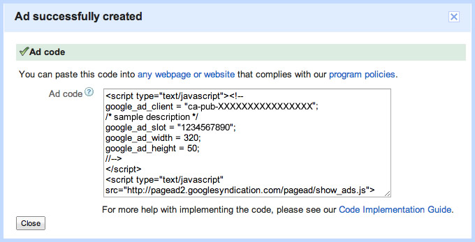
After you create an ad and you select Get code, you should see a dialog box with the script you would typically copy and paste to put on your page. It should look something like this:

JavaScript
By default, Google AdSense ads are not responsive; therefore, we have to implement some JavaScript trickery to make it responsive. We do this by creating different-sized ads and using the browser’s width to determine which size ad to load. Here’s a look at the JavaScript hack:
<script type="text/javascript"><!--
  google_ad_client = "ca-pub-XXXXXXXXXXXXXXXX";
  if (window.innerWidth <= 350) {
    // Small ad
    google_ad_slot = "XXXXXXXXXX";
    google_ad_width = 320;
    google_ad_height = 50;
  } else if (window.innerWidth >= 750) {
    // Large ad
    google_ad_slot = "XXXXXXXXXX";
    google_ad_width = 728;
    google_ad_height = 90;
  } else {
    // Medium (fallback) ad
    google_ad_slot = "XXXXXXXXXX";
    google_ad_width = 468;
    google_ad_height = 60;
  }
//--></script>
For this example, create 3 different-sized ads: small for mobile devices, medium for tablets, large for desktop (I used a 320x50 for small, 468x60 for medium, and 728x90 for large).
Then with the example above, replace the google_ad_slot value, google_ad_width value, and google_ad_height value with the corresponding ad you created for that specific size (you’ll get those values by clicking Get code in Google AdSense within My Ads) in the proper section within the if/else statement.
If you’re comfortable enough and would like to adjust the small/large values, go ahead and do so.
CSS
The JavaScript works great, but if for example the site is loaded on a browser that’s 900px wide, then resized to 600px wide, since the large ad would have loaded, it would throw off the responsiveness, thus allowing for horizontal scrolling.
In order to hide the overflow and prevent horizontal scrolling, you just need to wrap the script inside of a div and with one line of CSS, hide the overflow, which is as follows:
.js-gads {
  overflow: hidden;
}
Usage
In closing, once you add the CSS to your stylesheet, you would achieve a responsive Google AdSense ad with the following:
<div class="js-gads">
  <script type="text/javascript"><!--
    google_ad_client = "ca-pub-XXXXXXXXXXXXXXXX";
    if (window.innerWidth <= 350) {
      // Small ad
      google_ad_slot = "XXXXXXXXXX";
      google_ad_width = 320;
      google_ad_height = 50;
    } else if (window.innerWidth >= 750) {
      // Large ad
      google_ad_slot = "XXXXXXXXXX";
      google_ad_width = 728;
      google_ad_height = 90;
    } else {
      // Medium (fallback) ad
      google_ad_slot = "XXXXXXXXXX";
      google_ad_width = 468;
      google_ad_height = 60;
    }
  //--></script>
  <script type="text/javascript" src="http://pagead2.googlesyndication.com/pagead/show_ads.js"></script>
</div>
Demo
I created a live demo example for you to try it along with a download link for you to try it on your own website.