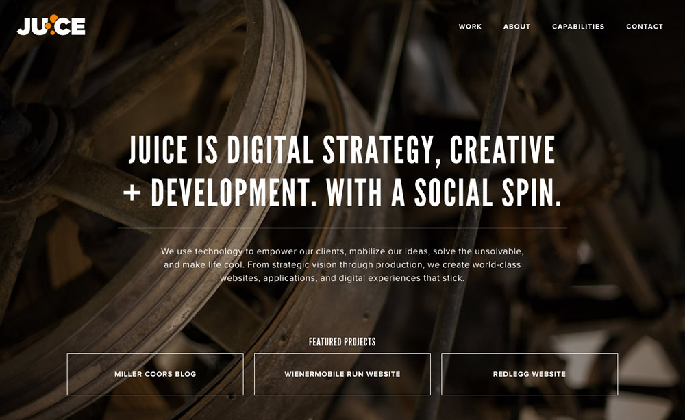

I joined Juice Interactive in the summer of 2013—We’re a small, talented team located in the West Loop of Chicago. Our website was in need of a facelift, and I was thrilled to be a part by being responsible for its development.

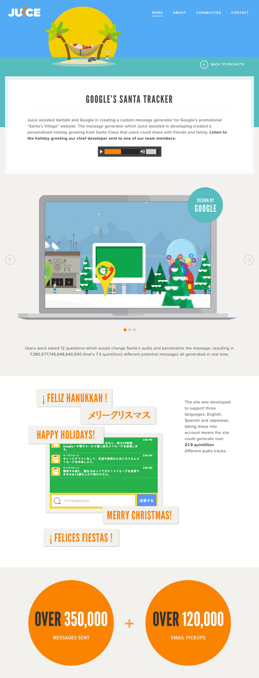
We didn’t just want to showcase our work—we wanted to take people through the process. We carefully crafted our words and hand-picked case studies to accurately represent and clearly communicate who we are, what we’re capable of, and what to expect when working with and cultivating a relationship with us.

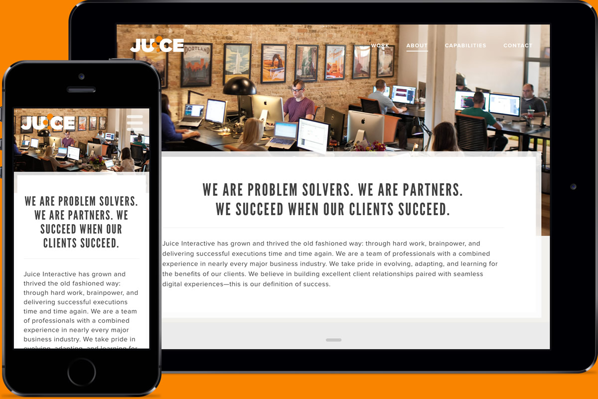
It was important to us that the content was accessible across a variety of devices and screen sizes, so it was designed and built with responsive design in mind. Built with a mobile-first approach, the website scales beautifully regardless of screen size.

I was given a lot of freedom to bring parts of the site to life, so I took some liberty by adding fun animations and interactions to the site.
While making sure we adhere to high web standards and utilize the latest web technologies, we also kept usability and accessibility in mind for mobile devices, tablets, and legacy web browsers down to Internet Explorer 9. The site was built with progressive enhancement and graceful degredation in mind.


